UX Comparison - Aer Lingus and Ryanair
At Arekibo, we conduct UX reviews by examining a product and gauging how it stacks up against several usability principles. This can include a UX comparison between two products. Aer Lingus and Ryanair are Ireland’s two leading airlines, with most of their business taking place through their online channels. We recently ran a quick UX comparison study between the websites of these two airlines, to see how they measure up. This wasn’t an exhaustive study as we focused on one user journey and just a few key usability principles. But it demonstrates how quickly the usability of a digital product can be assessed.
Methodology
In this post, we will focus on these key principles:
- Suitability for the task – Does the product support users in the effective and efficient completion of a task?
- Self-descriptiveness – Is it clear to users where they are in the process, what actions can be taken and how they can be performed?
- User control – Can the user initiate and control the direction and pace of the interaction until the point at which they achieve their goal?
Customers can carry out numerous actions, such as browse flights, manage bookings, check in and purchase extras such as insurance and car hire. The primary user goal we identified and tested was to book a flight. For this example, a flight from Dublin to London for 2 adults, departing Dublin on April 28th and returning on the 30th. We also concentrated primarily on the desktop sites. While Ryanair displayed its responsive website for us on an iPhone 6, Aer Lingus displayed the desktop site and a banner linking to the mobile app on the App Store. Ryanair have the obvious advantage here. Even though both airlines have mobile apps, they provide a mobile experience upfront for those who don’t have the app installed. We’ll start at the homepage and work through the search and booking process for both sites.
Homepage
Both sites have a similar homepage layout. They both display their flight search feature prominently, initially displaying “From” and “To” input fields that expand when you interact with them, displaying destinations and date pickers. For a city like London, with more than one airport, Ryanair makes you choose the airport you want to travel to. Aer Lingus offers “London England Area” as a destination, searching flights for all London’s available airports. This is useful, as choosing between Gatwick and Stansted would be less important for many customers than being able to compare the best value options. With the Aer Lingus setup however, the location selection feature could be slightly troublesome for users, as typing a location and hitting the return key will select the first airport in the list. When I type “New York” in the “To” field, the first airport listed is Albany in New York State – because of the list’s alphabetical order - and not the most popular airport, presumably JFK in New York City. Ryanair’s date picker displays two months by default; Aer Lingus displays three, offering a little more choice upfront. Also, Ryanair’s calendar does not have a default, whereas Aer Lingus default to a two day trip, starting tomorrow.
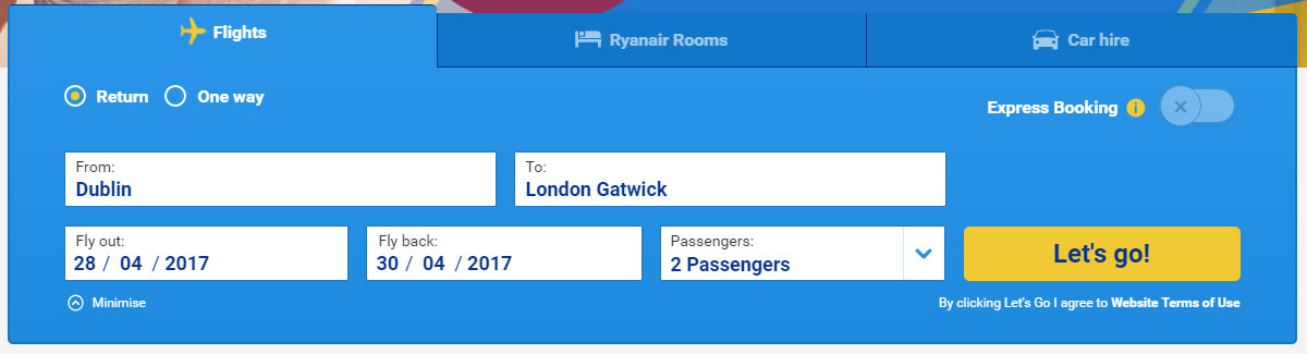 Ryanair’s search banner
On the Aer Lingus search banner, what appears to be another input area is displayed prominently, labelled “Saver”. No interaction is possible here however. On transatlantic flights, this is a dropdown, with other options, “Low fare” and “Business” for example. For a flight to London however, the input field is disabled and not hidden. A promotional code field is also displayed, which is self-explanatory.
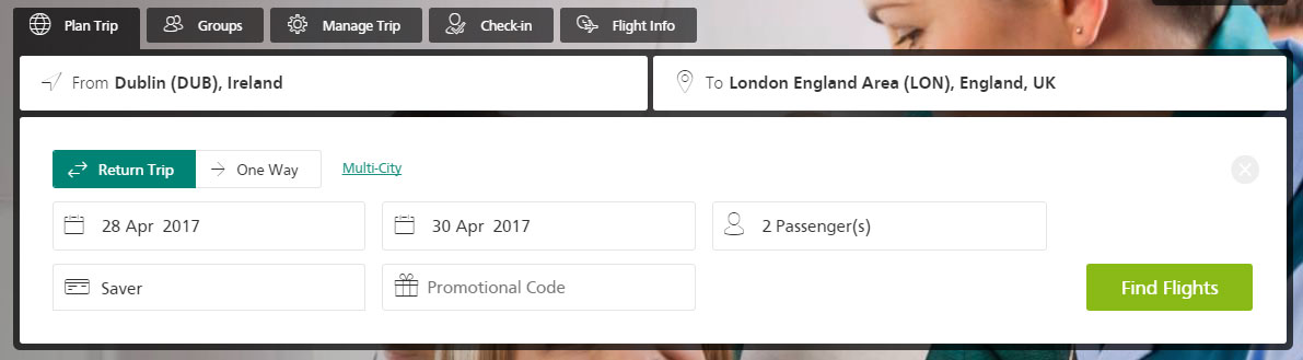 The Aer Lingus search banner
Results Page
On the flight search results page, both airlines display the advantages of upgrading to a more expensive fare class. Aer Lingus displays this upfront, along with the price options for all flights. Ryanair displays this only when you’ve chosen a flight.
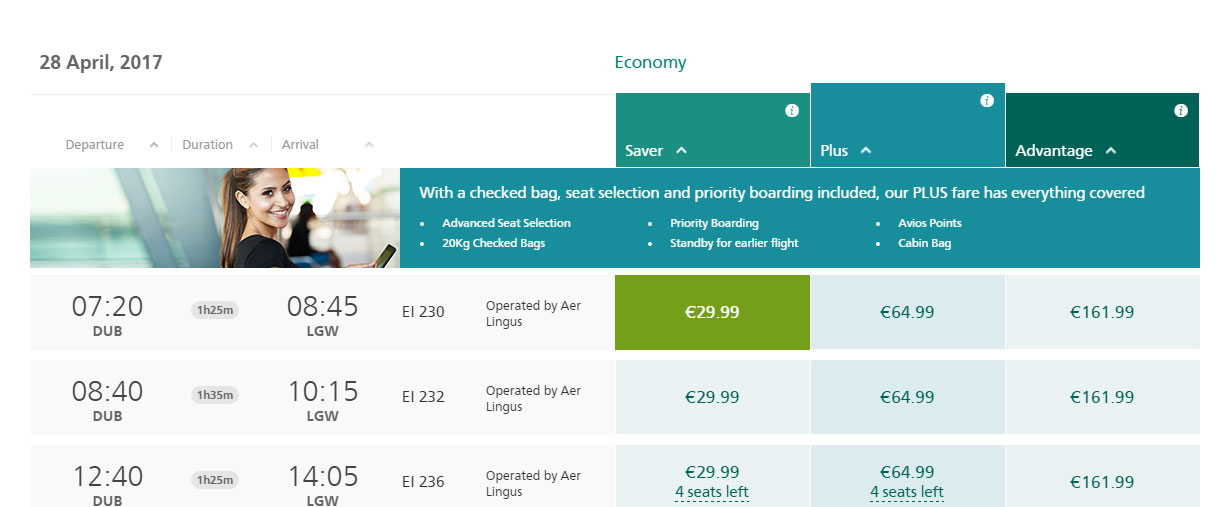 Aer Lingus upgrade options
Both airlines have a date switching feature. This allows you to quickly see the cheapest flight on other days and switch dates to see the full range of available flights. This is useful as customers are often happy to be flexible with their dates if a better deal is available. Ryanair has a nice feature in that when you select an outbound flight, the display scrolls down to the return flight options. And selecting a return flight moves you down to the Confirm button. This helps move you through the flight selection step quickly. With Aer Lingus, users have to manually scroll through the page to progress through flight selection.
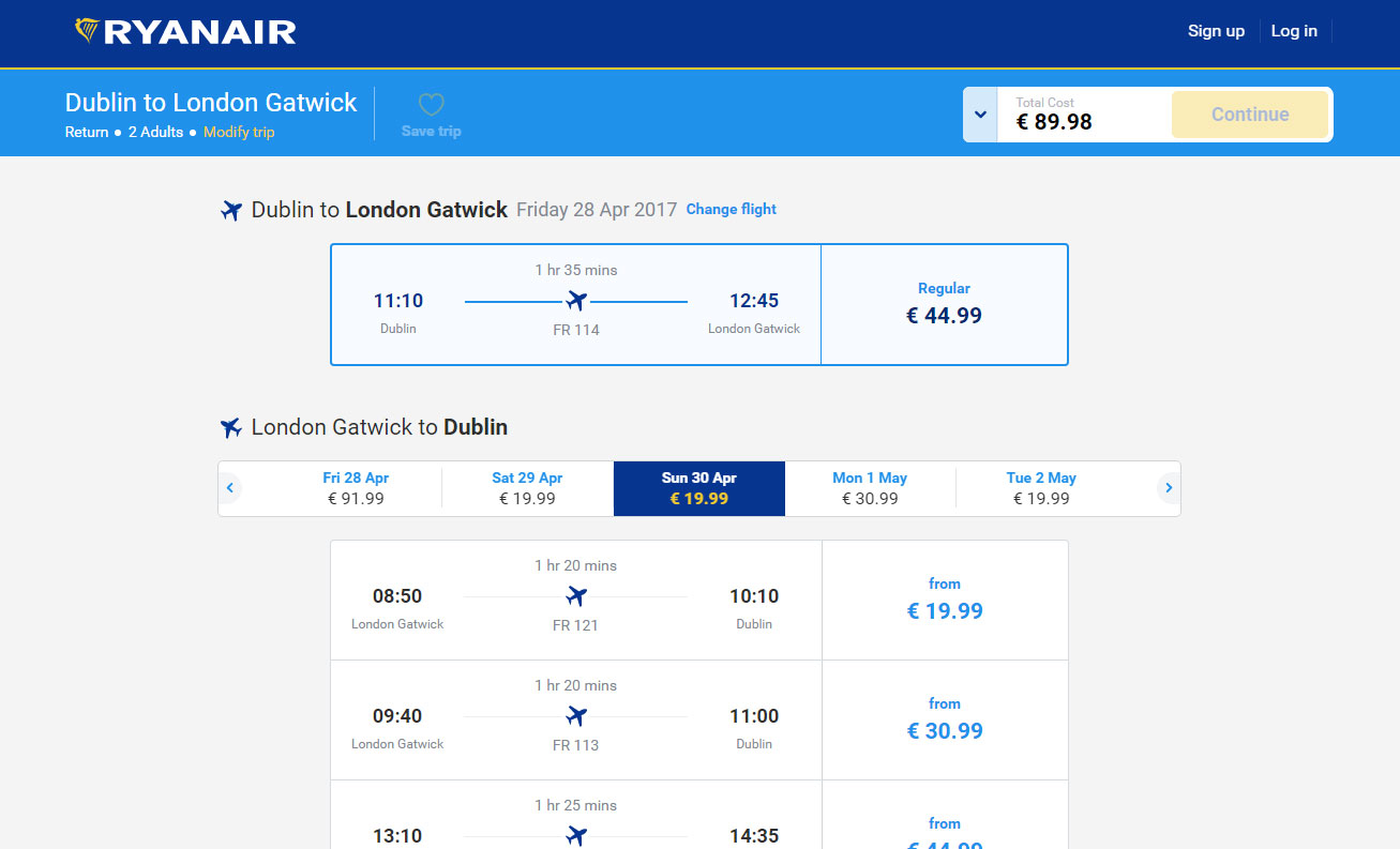 Ryanair’s flight selection
Both websites display a running total at the top of the screen, which updates when you select a different flight.
Booking Process
After selecting flights, the priorities of the airlines change. Aer Lingus collects customer information at this point, while Ryanair advertises extras, such as seat selection and insurance. There are a lot of competing calls-to-action on the Ryanair screen. The checkout button is displayed prominently but this content could slow users down a little.
 Ryanair’s optional extras
After choosing to skip Ryanair’s extras and proceed to check out, a pop up modal is displayed, listing the advantages of reserving a seat. You now need to choose the secondary call-to-action to get to the checkout page.
 Ryanair’s seat selection modal
After doing this, you need to login to MyRyanair to continue.
Passenger Details & Payment
The Aer Lingus passenger details step feels like more work than Ryanair’s, it includes optional extras such as frequent flyer information and SMS alerts.
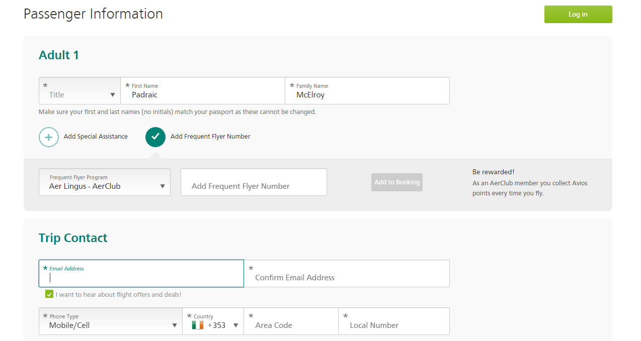 Aer Lingus passenger information
Following this step, Aer Lingus displays two separate pages of extras and users must scroll through both before finding Continue buttons at the bottom of each page. The first page has an additional prompt to add checked bags. Ryanair’s display of extras, as shown above, is contained on one page and not two, and users can skip past it easier, with a checkout button at the top of the page. After scrolling through the Aer Lingus extras, you proceed to the payment step. You need to be logged in to complete the passenger details and payment steps with Ryanair, however they collect minimal passenger details here, allowing you through to the payment step quicker.
Conclusion
Both sites have good features that help customers quickly browse and book flights. Ryanair having a mobile responsive website gives them an obvious edge. However the need for users to be logged in to complete a booking is a drawback. For the task that we chose, Ryanair’s flight selection step is smoother. While there is a mandatory step for customers to consider extras, this step can be bypassed faster, whereas Aer Lingus customers must scroll through two pages of extras. For these reasons, we found that Ryanair provides the better experience. Depending on the product and client objectives, our UX audits can be more comprehensive, taking in other usability principles as well as other methods such as usability testing.
If you’d like to know more about how your digital channels compare with your competition, or you are interested in a standalone UX audit, feel free to contact us
here.
For more details on how we can assist you with your website's UX, take a look at our range of
UX Services.