Design Systems
Standardise, Accelerate & Scale Your Digital Products
Design Systems are frameworks that provide a collection of reusable components, guidelines, and standards for creating consistent, scalable digital products. They include visual elements such as colour palettes, typography, and iconography, alongside functional components like buttons, forms, and navigation. Implementing a design system streamlines your design and development processes, allowing teams to work more efficiently while maintaining your brand identity across all digital channels. As your system grows, new products can be rapidly prototyped and scoped using your library of components, reducing duplication, fostering collaboration, and building momentum project by project.
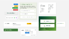
Client spotlight - HPRA
/hpra---website-development.webp?sfvrsn=fafb5bac_1)
Project: Design System for Health Products Regulatory Authority
Challenge - The Health Products Regulatory Authority (HPRA) required a scalable design system to ensure consistency across its digital products and platforms. The system needed to support their complex information architecture while maintaining strict accessibility and usability standards for diverse user groups.
Our Solution - We developed a comprehensive design system encompassing colour palettes, typography, iconography, and reusable UI components, such as buttons, forms, navigation elements, and data tables. Every component was designed and tested to WCAG 2.2 AA standards, ensuring accessibility from the outset.
Outcome - The design system enables HPRA to prototype, design, and develop new digital services faster and more consistently. Teams now work from a shared language and component library, reducing duplication, improving collaboration, and ensuring a cohesive experience across all regulatory touchpoints.
Why Design Systems Matter
Design systems are the ingredients for product innovation, providing a foundation for consistency, efficiency, and scalability across your entire digital ecosystem.
Key Benefits of Design Systems
- Design Consistency - Ensures that all digital products and platforms have a unified look and feel, reinforcing brand recognition.
- Accelerated Collaboration - Facilitates more effective communication and collaboration between design and development teams.
- Faster Time to Market - Create real-world concepts faster with a growing library of reusable assets.
- Built-in Efficiency - Save time by reusing design components, reducing repetitive work and duplication of effort.
- Faster Iteration - Quickly adapt and implement design changes across your entire product portfolio.
- Cost Savings - Reduce development costs by leveraging built and tested components from the design system.
- Better User Experience- Use customer-validated, tested, accessible design elements to deliver a cohesive, reliable experience.
- Device Ready - Build new features that are browser- and device-tested and approved from day one.

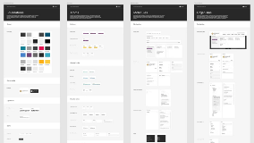
/rsa-design-system.tmb-.webp)
/brett-martin-design-system.tmb-.webp)
Can we help you with your design system?
Our Design Systems Capabilities
Our UX and design team follows best practice standards to create scalable, maintainable design systems that empower your teams to move faster and deliver more consistent experiences.
Our design systems services include:
- Design System Strategy & Discovery - Assessing your current design and development workflows, identifying pain points, and defining the scope and governance model for your system.
- Visual Language Definition - Establishing colour palettes, typography scales, iconography, spacing systems, and motion principles aligned with your brand.
- Component Library Creation - Designing and documenting reusable UI components (buttons, forms, cards, navigation elements, and more) with clear usage guidelines.
- Interactive Pattern Library - Building a living library of components and patterns that designers and developers can reference and implement.
- Accessibility Integration - Embedding WCAG 2.2 AA standards into every component, ensuring your system is inclusive by default.
- Technical Implementation - Working with your development teams to translate designs into code, creating reusable, documented components in your technology stack.
- Governance & Maintenance - Establishing processes for versioning, contribution, updates, and ongoing governance to keep your system healthy and relevant.
- Team Training & Enablement - Equipping your design and development teams with the knowledge and confidence to adopt, contribute to, and maintain the system.
Contact us to discuss your next project
Design Systems Solutions by Business Function
Design systems deliver measurable value across every part of your organisation, enhancing productivity, ensuring consistency, and accelerating digital delivery.
Design systems support business goals by enhancing productivity, ensuring product consistency, and improving speed to market.
- Faster Time to Market - Launch products faster by reducing repetitive design and development time.
- Improved Customer Satisfaction - Deliver a more cohesive, reliable, and recognisable product experience across all touchpoints.
- Reduced Costs - Minimise costs by using reusable components and reducing design/development overlap and rework.
- Greater Flexibility - Easily adjust products to meet changing market demands without rebuilding from scratch.
- Competitive Advantage - Stand out by consistently delivering high-quality, branded experiences that build trust and recognition.
Design systems ensure your brand is consistently represented across all marketing materials, both digital and physical.
- Consistent Branding: - Maintain a cohesive brand presence across websites, apps, campaigns, and communications.
- Faster Campaign Execution: - Quickly deploy landing pages, microsites, and marketing assets that adhere to brand guidelines.
- Improved Audience Trust - Build trust by delivering a familiar, consistent brand experience across every interaction.
- Enhanced Visual Appeal - Use predefined, tested elements to create visually appealing marketing materials without reinventing the wheel.
- Better Cross-Platform Experiences - Ensure users have a seamless experience regardless of where they encounter your brand: web, mobile, or social channels.
Design systems help you manage resources more effectively, streamlining operational processes and controlling costs.
- Resource Optimisation - Use resources more effectively by reducing duplication of effort across design and development.
- Cost-Effective Scaling - Scale product design and development without incurring high additional costs.
- Enhanced Efficiency - Increase productivity by using standardised, tested components rather than building from scratch each time.
- Reduced Maintenance Costs - Simplify updates and maintenance by having a unified system. Changes propagate consistently.
- Improved Financial Forecasting - Plan budgets more accurately with predictable design and development costs enabled by reusable assets.
Design systems simplify development by providing pre-built, tested components that are ready for implementation.
- Streamlined Development - Use pre-built components to speed up development time and reduce context switching.
- Reduced Technical Debt - Avoid redundant, inconsistent code by reusing standardised, tested components.
- Improved Quality Assurance - Standardise elements to reduce inconsistencies, bugs, and errors across products.
- Better Scalability - Easily scale products and add new features without compromising on design consistency or quality.Enhanced Code Reusability - Share and reuse code across different parts of the product and across different projects, improving efficiency and maintainability.
Design Systems - FAQs and toolsets
What is a design system?
A design system is a comprehensive set of standards, documentation, and reusable components for designing and building digital products. It includes visual elements (colour, typography, iconography), UI components (buttons, forms, cards), and guidelines for how and when to use them.
What is the difference between a design system, a style guide, and a component library?
A style guide documents visual identity: colours, typography, logo usage. A component library is a collection of reusable UI elements (buttons, modals). A design system is the overarching framework that includes both, plus governance, usage guidelines, and the processes for maintaining consistency across products.
How long does it take to build a design system?
Timelines vary based on scope and complexity. A foundational system for a single product may take 2–3 months; an enterprise-scale system supporting multiple products and platforms can take 6–12 months. We phase delivery to provide value incrementally.
Do you build design systems in code, or just design?
Both. We provide design assets (Figma, Sketch, Adobe XD libraries) and can work with your development teams to implement components in your technology stack, whether React, Angular, Vue, or custom frameworks.
How do you ensure the design system works for both designers and developers?
We involve both disciplines throughout the process. Components are designed with development constraints in mind, and we document usage guidelines, code snippets, and implementation notes to bridge the gap between design and development.
Can you integrate accessibility into our design system?
Yes. Accessibility is embedded into every component from the start. We ensure colour contrast, keyboard navigation, focus states, screen reader compatibility, and semantic structure meet WCAG 2.2 AA standards, making your system inclusive by default.
How do we maintain the design system after launch?
We help you establish governance processes, including versioning, contribution models, and update workflows. We can also provide ongoing support, training, and periodic audits to keep your system healthy and relevant as your products evolve.
Do you offer training for our teams?
Yes. We provide training sessions for designers, developers, and product managers to ensure your teams understand how to use, contribute to, and maintain the design system effectively.
Can a design system work with our existing brand guidelines?
Absolutely. We use your existing brand identity as the foundation, extending and translating it into a scalable digital system that ensures consistency across every product and touchpoint.
How do you measure the success of a design system?
Success metrics include faster design and development velocity, reduced redundancy, improved consistency scores, fewer accessibility issues, higher developer and designer satisfaction, and ultimately, faster time to market for new features and products.
| Deliverable | Description | Best Used For |
| Design System Audit & Discovery | Assessment of current design assets, development patterns, and workflows, with recommendations for system scope and governance. | Understanding baseline, defining requirements, and securing stakeholder buy-in. |
| Visual Language Definition | Colour palettes, typography scales, iconography, spacing systems, motion principles, and brand alignment documentation. | Establishing a foundation, ensuring brand consistency, and designer reference. |
| Component Library (Design) | Reusable UI components designed in Figma/Sketch/Adobe XD, including buttons, forms, cards, navigation, and modals. | Rapid prototyping, design consistency, and handoff to development. |
| Component Library (Code) | Developed, tested, and documented components in your technology stack (React, Angular, Vue, etc.). | Faster development, reduced technical debt, consistent implementation. |
| Usage Guidelines & Documentation | Clear documentation covering when and how to use each component, with code snippets and accessibility notes. | Onboarding teams, ensuring correct usage, and maintaining quality. |
| Governance & Contribution Model | Processes for versioning, updates, contributions, and ongoing maintenance. | Long-term sustainability, team empowerment, and avoiding drift. |
| Team Training & Workshops | Custom training sessions for designers, developers, and product managers. | Building internal capability, ensuring adoption, and fostering collaboration. |
Design System - A complete framework of standards, documentation, and reusable components used to design, build, and maintain digital products at scale. Includes visual language, UI components, and governance processes.
Component Library - A collection of reusable UI elements (buttons, forms, cards, modals) that can be assembled to build interfaces. Can exist in design tools and/or code.
Style Guide - Documentation of visual identity elements, including colours, typography, logo usage, and brand guidelines. Often, a subset of a broader design system.
UI Kit - A file or set of files (usually in Figma, Sketch, or Adobe XD) containing reusable design components for prototyping and design work.
Design Tokens - Named entities that store visual design attributes such as colours, typography, spacing, and motion values. Used to maintain consistency across platforms and tools.
Pattern Library - A collection of reusable UI patterns and interaction designs that solve common user problems, such as search, filtering, or onboarding flows.
Governance - The processes, roles, and responsibilities for managing, updating, and evolving a design system over time.
Versioning - The practice of tracking and managing changes to a design system, allowing teams to reference specific versions and manage updates systematically.
Contribution Model - A defined process for how team members can propose, develop, and add new components or patterns to the design system.
Accessibility - The practice of making products usable by people with disabilities. In design systems, this means every component is designed and coded to meet WCAG standards.
WCAG (Web Content Accessibility Guidelines) - Internationally recognised standards for digital accessibility. We design and test components to the WCAG 2.2 AA level.
Figma / Sketch / Adobe XD - Industry-standard design tools used to create and share component libraries and design systems.
Storybook - A popular tool for developing and documenting UI components in isolation, often used alongside React, Vue, and other frameworks.
Ready to Standardise and Scale Your Digital Products?
Let's discuss how a design system can accelerate your teams, reduce costs, and deliver consistent, high-quality experiences across every product and platform.